
Views: 14,829 | Published: Saturday, 2 of May 2026
The 2026 Color Palette is officially here, and it is a massive departure from the muted "sad beige" era we’ve endured for the last few years. As we move further into the decade, design is becoming more theatrical, more emotional, and significantly more experimental. Whether you are a brand strategist, an interior designer, or just someone looking to refresh your living space, understanding these shifts is crucial for staying ahead of the curve.
At Coolblogs, we’ve been tracking these shifts closely. From the influence of digital subcultures to the resurgence of 70s nostalgia, the colors of 2026 are all about storytelling. This year’s trends aren't just about what looks good on a screen; they are about how a space or a product makes you feel.
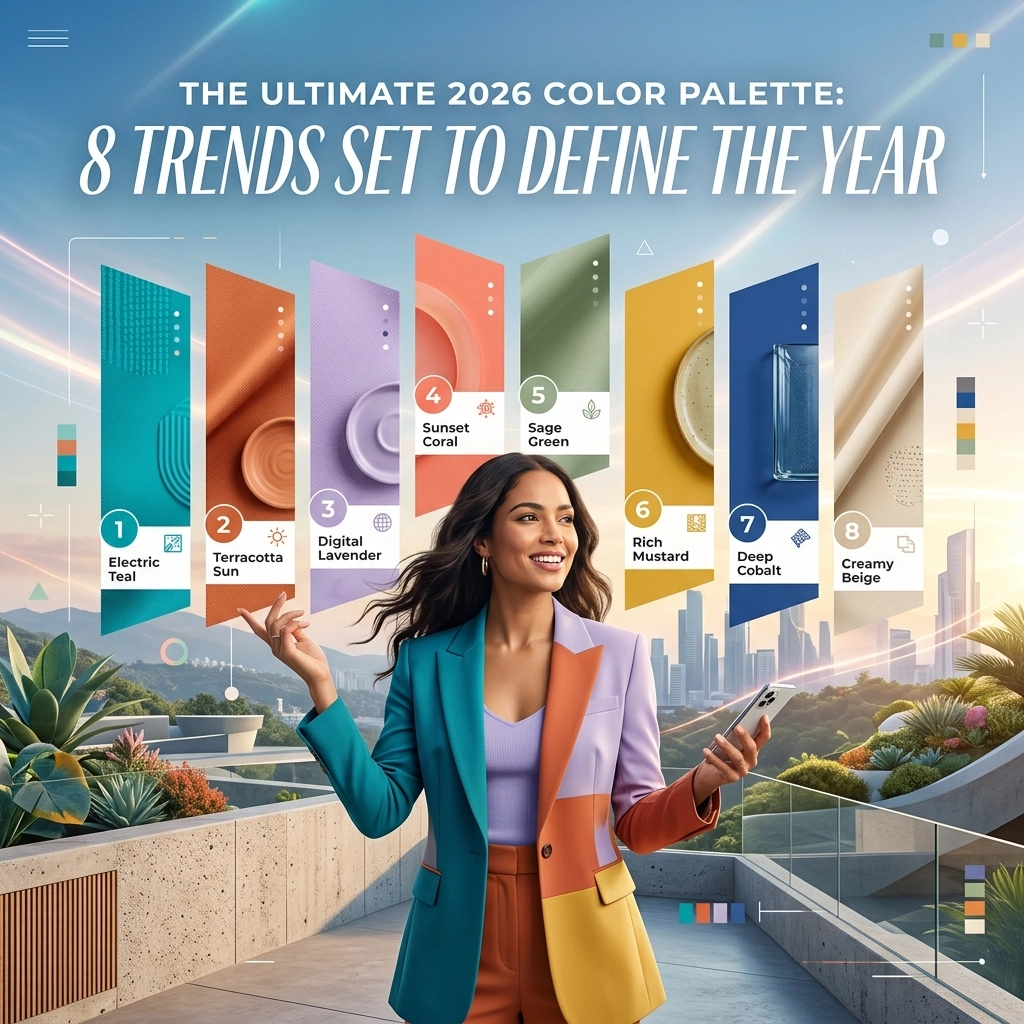
Below is the definitive roundup of the 8 color trends that are defining the 2026 Color Palette.
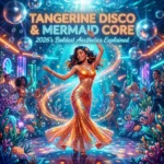
1. Mermaid Core: The Ethereal Aquatic Escape
Trending: High | Popularity: 92%
Mermaid Core has evolved from a niche TikTok aesthetic into a dominant force in the 2026 Color Palette. This trend is characterized by iridescent aquas, soft teals, and seafoam greens that mimic the shifting light of the ocean.
- Key Colors: Iridescent Aqua, Deep Sea Teal, Pearl White.
- The Vibe: Dreamy, fluid, and slightly surreal.
- Best For: Bathroom interiors, high-end packaging, and digital interfaces.
The shift toward aquatic tones reflects a global desire for tranquility and fluid movement in design. It’s less about "nautical" kitsch and more about the shimmering, translucent quality of water.

Alt text: Mermaid Core aesthetic featuring iridescent aqua and soft teal tones as part of the 2026 Color Palette.
Explore more about creative visuals in our Design Tag.
2. Banana Yellow: The Ultimate Mood Lifter
Trending: Rising | Popularity: 78%
If 2025 was about "Butter Yellow," then the 2026 Color Palette is taking it a step further with Banana Yellow. This is a cheerful, saturated pastel that feels optimistic without being overwhelming. It’s a "happy" color that works surprisingly well as a neutral base when paired with the right accents.
- Application: Ideal for kitchen cabinetry and summer fashion lines.
- Impact: Promotes feelings of warmth and radical optimism.
- Why it works: It bridges the gap between high-energy neon and boring beige.
This shade is often seen in hospitality design to create a welcoming, sun-drenched atmosphere. You can check out how these colors are categorized in our Categories Sitemap.
3. Tangerine Disco: Theatrical Energy
Trending: Viral | Popularity: 89%
Tangerine Disco is perhaps the most energetic entry in the 2026 Color Palette. It’s a rich, deep orange that feels inherently theatrical. Think Taylor Swift album aesthetics: bold, expressive, and impossible to ignore. It’s a color that demands a spotlight.
- Aesthetic: Mid-century modern meets 2020s maximalism.
- Usage: Statement furniture, bold branding, and accent walls.
- Pro Tip: Pair it with "Walnut Retro" (see trend #7) for a sophisticated, grounded look.
This trend is a reaction against the minimalism of the past decade. People are no longer afraid of "loud" colors; they are embracing the drama. Read more about bold trends in our Cool Tag.

Alt text: A bold Tangerine Disco interior design showcasing the theatrical side of the 2026 Color Palette.
4. Sunwash: Nostalgic Minimalism
Trending: Stable | Popularity: 85%
Sunwash is the "quiet luxury" of the 2026 Color Palette. It consists of dusty pinks, chalky blues, and sun-bleached yellows that feel like a faded photograph from a Mediterranean holiday. It’s nostalgic, soft, and incredibly easy to live with.
- Key Palette: Muted Terracotta, Dusty Sky, Chalky Sand.
- Psychology: Evokes a sense of history and "lived-in" comfort.
- Context: Heavily influenced by the growing interest in sustainable, natural materials.
As we look for more authenticity in our environments, Sunwash provides a backdrop that feels human and aged rather than clinical and new. For more on lifestyle and art, visit our Art Tag.
5. Clubber and Contrast: The Return of Inky Tones
Trending: High | Popularity: 81%
The 2026 Color Palette isn't all pastels and brights. "Clubber and Contrast" brings a needed edge to the year. This trend utilizes inky blacks, deep charcoal, and metallic golds to create a sense of mystery and luxury.
- The Duo: Inky Black + Liquid Gold.
- Inspiration: Late-night nightlife, luxury tech, and high-fashion editorial.
- Visual Teaser: Imagine a matte black room with a single, glowing gold light fixture…
This trend is perfect for creating intimate spaces like bars, bedrooms, or premium app interfaces. It’s about high-contrast drama that feels sophisticated and expensive. Check out our Technology Tag to see how this applies to modern gadgetry.

Alt text: Luxury dark interior with gold accents, a key part of the Clubber and Contrast 2026 Color Palette.
6. Neon Shock: Digital High Voltage
Trending: Fast | Popularity: 74%
Driven by the influence of AI and the "Metaverse" aesthetic (which is finally maturing), Neon Shock introduces high-voltage electric greens and acid yellows into the 2026 Color Palette. These aren't your typical 80s neons; they are "digital-first" colors designed to pop on OLED screens.
- Primary Shades: Electric Lime, Cyber Purple, Acid Yellow.
- Application: Gaming setups, streetwear, and digital marketing.
- Effect: High energy, futuristic, and attention-grabbing.
Neon Shock is often used in small bursts to "energize" a more neutral palette. See how this is trending in our Posts Sitemap.
7. Walnut Retro: 70s Earthbound Comfort
Trending: Massive | Popularity: 95%
If you have noticed a sudden influx of wood-paneled walls and chocolate brown sofas, you are seeing "Walnut Retro." This trend anchors the 2026 Color Palette in the 1970s. It’s all about deep browns, rich chocolates, and warm wood grains.
- Pairs With: Mustard Yellow, Avocado Green, and Tangerine.
- Vibe: Sophisticated, grounded, and incredibly cozy.
- Why it’s back: In a digital world, we crave the tactile, "real" feel of wood and earth tones.
Walnut Retro is the perfect antidote to the "sterile" look of the early 2020s. It feels permanent and sturdy. Learn more about historical design shifts in our General Tag.

Alt text: A retro 70s-inspired living room featuring deep walnut browns, a staple of the 2026 Color Palette.
8. Thermal Glow: The Tech-Infused Heatmap
Trending: Experimental | Popularity: 68%
Thermal Glow is perhaps the most unique trend in the 2026 Color Palette. Inspired by heat-mapping technology and infrared photography, this palette uses purples, fiery oranges, and deep indigos to create a "glowing" effect.
- The Look: Gradient transitions that feel like they are emitting heat.
- Usage: Graphic design, high-concept fashion, and avant-garde lighting.
- Teaser: This is the color of 2026's most innovative tech launches…
This trend highlights the intersection of science and art. It’s a visual representation of energy and temperature, making it a favorite for brands that want to seem cutting-edge.

Alt text: Abstract thermal glow gradient illustrating the experimental side of the 2026 Color Palette.
Quick Summary: Which Palette is Yours?
| Trend | Main Color | Best For | Vibe |
|---|---|---|---|
| Mermaid Core | Aqua/Teal | Wellness/Bathrooms | Ethereal |
| Banana Yellow | Pastel Yellow | Kitchens/Spring | Optimistic |
| Tangerine Disco | Rich Orange | Branding/Accents | Theatrical |
| Sunwash | Dusty Pink | Living Rooms | Nostalgic |
| Clubber | Black/Gold | Luxury/Nightlife | Moody |
| Neon Shock | Electric Green | Gaming/Digital | High Energy |
| Walnut Retro | Chocolate Brown | Furniture/Interiors | Grounded |
| Thermal Glow | Purple/Orange | Graphic Design | Futuristic |
Recent Trends in Design
- Sustainability: Natural dyes are influencing the Sunwash and Walnut Retro palettes…
- Digital Integration: Neon Shock is becoming the standard for mobile UI/UX…
- Theatrical Interiors: Tangerine Disco is replacing the accent wall with "accent rooms"…
More to Explore
That’s a wrap on the colors that will be everywhere this year! Honestly, the 2026 Color Palette is one of the most exciting we’ve seen in a long time because it actually allows for some personality. No more playing it safe with greige: it’s time to pick a side, whether you’re going full 70s retro or high-voltage neon.
I’m personally leaning towards the Walnut Retro vibe for my home office, but that Tangerine Disco is calling my name for some new branding projects. What about you? Which one of these is making it into your world this year?
That's all for now! Stay colorful! 😎🎨✨